Do you make responsive websites? if yes then you will need one of these online tool to test the responsiveness of your websites.
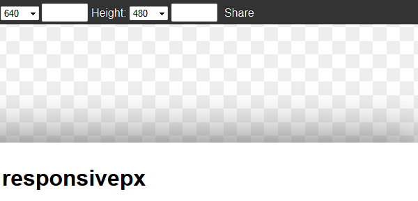
Responsivepx
Enter the url to your site – local or online: both work – and use the controls to adjust the width and height of your viewport to find exact breakpoint widths in pixels. Then use that information in your media queries to create a responsive design.
Responsinator
The Responsinator helps website makers quickly get an indication of how their responsive site will look on the most popular devices. It does not precisely replicate how it will look, for accurate testing always test on the real devices.
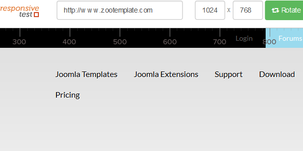
Responsivetest
ResponsiveTest is a simple tool allowing us to view a responsive web design in various resolutions.
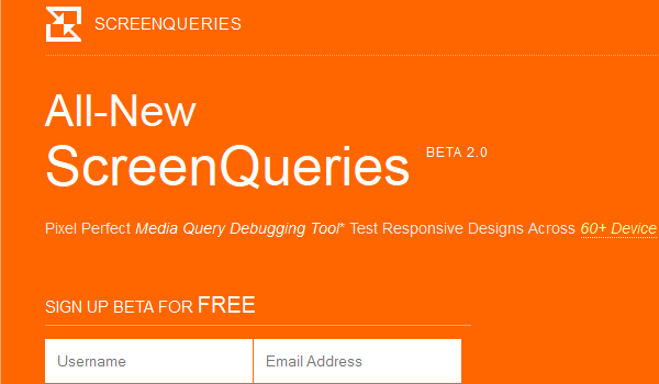
Screen Queri
Pixel Perfect Media Query Debugging Tool Test Responsive Designs Across 60+ Device Viewports.
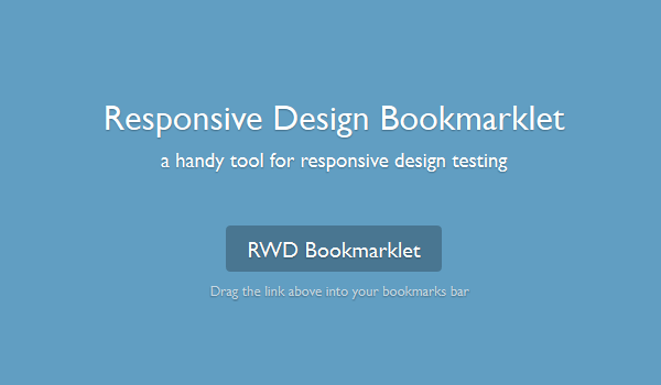
Responsive
A handy tool for responsive design testing. RWD Bookmarklet Drag the link above into your bookmarks bar.
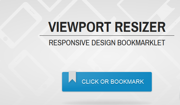
Viewport Resizer
Viewport resizer is a browser-based tool to test any website’s responsiveness. Just save the bookmarklet, go to the page you want to test, click on your created bookmarklet and check all kinds of screen resolutions of the page.
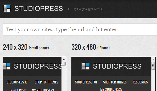
StudioPress Responsive Testing Tool
BrowserStack
BrowserStack is basically an online cross-browser testing tool and was launch a few years back. It provides designers, developers and testers with a cloud platform in order to test their web applications. BrowserStack has been serving more than 200,000 registered users across the globe.